Hero banners - digital guide
Selecting photographs for a banner or header imagery should be judged on a case-by-case basis. Selecting photographs for a banner or header imagery should be judged on a case-by-case basis. It’s difficult to define concrete rules, but there are some clear Dos and Don’ts that should guide your decisions. We’ve also included an example to illustrate each do and don’t below.
For more information about using text on top of images and accessibility, see Text on images.
Dos
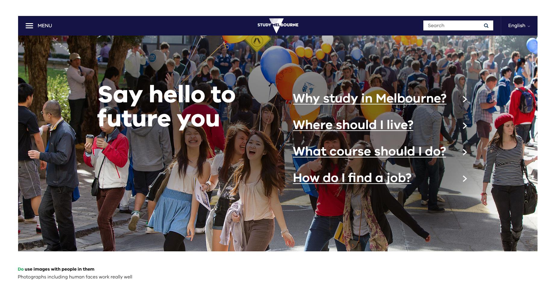
Do use images with people in them
Photographs including human faces generally work well. People in photographs should be engaged in an activity. Use common sense when selecting images – subject matter should be considered carefully.
Do use images that tell a story
Choose images that showcase what Victoria has to offer. Combine images and copy to tell a story. Photographs that don’t show people should still feel ‘alive’.

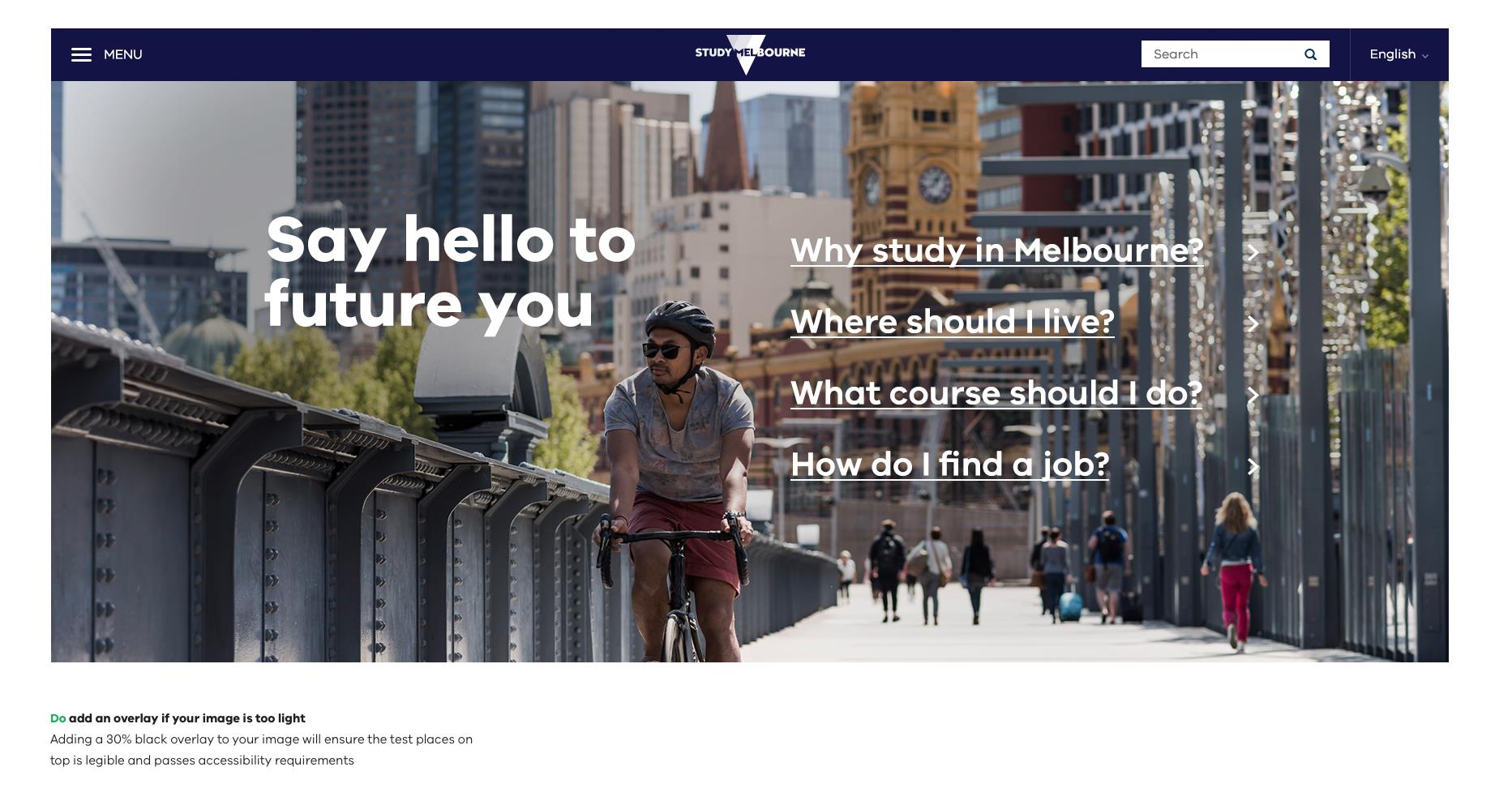
Do add an overlay if your image is too light
If there is not enough contrast between the text and image you are working with, and there is no alternative image, you’ll need to consider adding a 20%-40% black overlay if your chosen image is too light.

Do place text on flat colour to avoid accessibility issues
If using a background image is too tricky or it’s too hard to read text on top of a photograph it’s also great to use a big, bold colour for text to sit on in your hero banner.
Don’ts
Don’t use stretched or low-resolution images
Make sure images retain their proportions. Ensure images are large enough for the design.

Don’t use overly complex images
Complicated images can be distracting. These images can also make text inaccessible.

Don’t use images that are too light
Make sure there’s enough contrast between the type colour and the image behind it so that the combination is accessible. Adding a 20%-40% black overlay may help if your chosen image is too light.
Updated 5 July 2023
Join the conversation on digital
Get advice and share your insights with other digital practitioners. Join the Single Digital Presence Community of Practice(opens in a new window).
About the VIC Government
- The Premier and ministers
- Find a Vic Gov department, agency or service
- Strategies and policies
- Inquiries and royal commissions
Grants and programs
Jobs and careers
Arts, culture and heritage
Business and the workplace
- Mentally Healthy Workplaces Framework
- Portable Long Service Authority
- Victoria’s racing industry
- Workforce Inspectorate Victoria
- Liquor licensing, sale and supply
Communities
- Children
- First Peoples - State Relations
- Finding records
- Gender equality & women’s leadership
- LGBTIQA+ equality
- Multicultural communities
- Seniors Online
- Veterans support and commemoration
- Volunteering in Victoria
- Youth Central
Education and training
- Victorian Early Childhood Regulatory Authority
- Early childhood education – information for professionals
- Kinder: Best Start, Best Life
- Education – information for parents
- Schools.Vic - information for schools
- Education grants, programs, awards and events
- PROTECT
- TAFE, training and universities sector
- TAFE Victoria
- Victorian Skills Authority
- Apprenticeships Victoria
- Learn Local
Environment, water and energy
Finance and economy
Health and social support
- Family violence reform
- NDIS Worker Screening Check
- NDIS and disability services and support in Victoria
- Patient Review Panel
- Transforming Trauma Victoria
Housing and property
Law and justice
- Adoption
- Births, deaths and marriages
- Honorary justices
- Machete ban
- Safeguarding Victorians against terrorism
- Stolen Generations Reparations Package
- Victims of Crime
- Victorian Racing Tribunal
Safety and emergencies
- Emergency Recovery Victoria
- Victorian Emergency Relief and Recovery Foundation
- Emergency Recovery Resource Portal
- How well do you know fire
- Fire Services Reform
- Water safety
- Marine Search and Rescue
Science and technology
- Data sharing and open data
- Data.vic - discover and access Vic Gov open data
- Developer.Vic - portal for API developers
- Go.vic URL shortener
- Vic Gov IT project dashboard
- Victoria’s free public wi-fi network
- Cyber security in the Victorian Government
Sport and recreation
Traffic and transport
- Cameras Save Lives
- Transport Fines
- Getting Around
- Transport Planning
- Transport Future
- Climate Change and transport
- Future Directions For Transport
- Transport projects
- Ports and Freight
Working in the Victorian Government
- Single Digital Presence home
- Accommodation and Library Services
- Executive employment in the Victorian public sector
- Budget, procurement and funding
- Careers in the Victorian Government
- Council and Regulator Toolkit
- Guidelines for working in government
- Join a government network
- Standards and guidelines
- VicFleet CarPool
- Victorian Government style guide