Sample of all SDP components
This is the introduction text. It sits directly under the page title and gives an overview of what’s on the page.
Top links
- Header link test
- Sample page: Basic text component formatting options
- Sample of all SDP components - with no sidebar
The Victorian Government acknowledges Aboriginal Traditional Owners of Country throughout Victoria and pays respect to their cultures and Elders past and present.
This is an Introduction banner
This feature was created so that a webpage can have a hero image in the banner and then in this section you can include an intro sentence and feature links. These links display to the right.
Search
Search
Primary campaign
This is a primary campaign.
Primary campaign blocks sit at the top of the page, just under the header section and above the body content section.
How to build a primary campaign
On this page
- Card carousel (title optional in component)
- Content collection (new version in release 1.58)
- Compact card collection
- This is the title of the compact card collection
- Link list component
- Images
Basic text
The basic text component is for inserting body content. This gives you the WYSIWIG (what you see is what you get) window, where you can:
- format headings, paragraphs, lists, quotes and callouts
- add links and buttons
- insert images and other media.
Read our guides on using the basic text component on the Digital Victoria Help Centre.
See how things look on a live website on our Sample page: Basic text component formatting options.
Accordion (standard)
Open all
- The first accordion - when and why
Use them where a page has a lot of content the user doesn’t need to see all at once. The best use case is where you are providing information on several options and the user generally only needs to view ONE of the options.
- A second accordion - basic text features
Accordions have the same WYSIWIG window as the Basic text component. This means you still have the ability to:
- format headings, paragraphs, quotes and callouts
- add links, bullet points and buttons
- insert images and other media types.
- Another accordion - learn how to add an accordion
Read our guide to learn how to add accordions(opens in a new window).
Numbered accordion
Open all
- 1Add your content in the CMS
Sample content.
- 2Have your content reviewed
Sample content.
- 3Content is published
Sample content.
Cards
There are several card options that can be used for different purposes.
Promotion cards
Promotion cards are portrait-style (vertical) cards to link to other pages. They’re often used on homepages and landing pages to display the site’s main sections or subpages but can also link to external websites.
The first example has a thumbnail image and the second has a profile image. They can also be used with no image.
A ’no image’ promo card
This card has display style set in the CMS to ‘No image’ which on Ripple is called ‘Standard’.
A ’thumbnail’ promotion card
This card has display style set in the CMS to ‘Thumbnail’ which on Ripple is called ‘Image full bleed’.

A ‘profile’ promotion card
This card has display style set in the CMS to ‘Profile’ which on Ripple is called ‘Avatar’.
A ‘highlight’ promo card
This card has display style set in the CMS to ‘Highlight’ which on Ripple is called ‘Highlight’.
Navigation cards
Navigation cards are landscape-style (horizontal) cards to link to other pages. They highlight programs we support or link to pages with related topics.
The first example has a thumbnail image and the second has a featured image. They can also be used with no image.

Navigation card title
This is the summary. Give a brief, clear description of the link destination. NOTE: this navigation card has the Card display style set as ‘Thumbnail’ (must have an image)
How to add a navigation card
Instructions for adding navigation cards. NOTE: this navigation card has the Card display style set as ‘Featured’ (must have an image)
How to add a navigation card
NOTE: this navigation card has the Card display style set as ‘No image’
Call to action cards
A call to action (CTA) card is similar to a navigation or promotion card but with a button included. It is an invitation for your user to do something. It should be eye-catching and use active language.
The first example is a card CTA and the second is a banner CTA.

Learn how to add CTAs
Learn how to get the best use out of the call to action component. It displays as a large box when used on a page with a sidebar and a banner style when used on a page with no sidebar.
Key dates
The key dates component can be used to promote several important dates in a grid format. It is still under development and can be difficult to use.
Learn how to add key dates cards.
Key calendar dates
-
1 January 2021 to 1 January 2031
Event title 1
This is the summary, give a brief description of the key date.
-
1 February 2021 to 1 February 2031
Event title 2
This is the summary, give a brief description of the key date.
See a key dates card on our home page
Card sorting options
As well as adding cards individually, there some components can be configured to display groups of cards:
- Card carousel
- Content collection
- Compact card collection
Card carousel
Card carousels are a useful way to add a lot of cards without overcrowding a page. They can be set to auto-populate with news or events or you can manually add cards of your choice.
Read our guide to learn how to add card carousels(opens in a new window).
Card carousel (title optional in component)
vic.gov.au is the online entry point to Victorian Government information. The site is built on the Single Digital Presence platform.
Find more SDP user guides.
Single Digital Presence is the Victorian government’s Content Management System. Find out what features and services it offers.
Understand your options when using Single Digital Presence.
Content collection (new version in release 1.58)
Optional description.
This example has been configured as follows:
-
Content source: automatic
-
Refine content - Filter by Topics = Education & training
-
Display options: Card, no image displaying
-
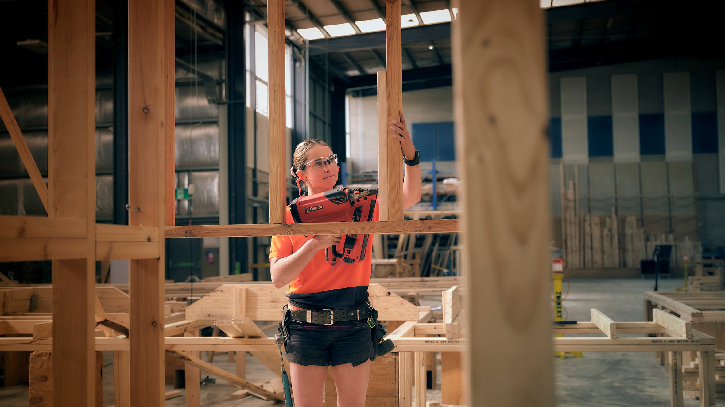
Clea builds her dreams with TAFE
Carpenter Clea wants to inspire more women to be apprentices.
Hear from parents, students and teachers about their experiences with their local public schools and the programs and opportunities on offer.
2026 Premiers’ Reading Challenge events.

Free TAFE helps the student become the teacher
Chris returned to study as a mature-aged student and is now an IT teacher, thanks to Free TAFE.

Report child abuse in the family
Report child abuse in the family using the 4 Critical Actions.

Identify child abuse by an adult engaged by a school
Guidance for identifying child abuse and reportable conduct involving an adult in a school, including grooming.
If your child has disability and high needs you may be able to enrol in a specialist school.
Premiers’ Reading Challenge 2026 giveaways and events.
Premier’s opening message for the Premiers’ Reading Challenge.
Access the education and training topic home page (CTA link text)
Compact card collection
Use the compact card collection to build a collection of clickable cards with an icon.
This is the title of the compact card collection
Learn how to create a compact card collection.
Put a description here of what you’re linking to.
If you have questions about using the Single Digital Presence platform, we are here to help. Follow the steps below to get the support you need.
Find out what Single Digital Presence has already delivered and what we’re planning to deliver next.
Link list component
Link list displays over 2 columns on large screen sizes with sidebar content turned off. Reading order is down column 1, then down column 2. When sidebar components (such as side navigation, Contact details or What’s next links) are included on a page, or the page is viewed on a smaller screen size such as a mobile, the link list displays in 1 column.
Read our link list user guide
Images
Image gallery
The image gallery is built in the Custom block library. Find out how to build image galleries.
-

-

-

-

-
### Avocado (This is the image name)
This is the image’s caption
View ‘Avocado (This is the image name)’ fullscreen
-
### Berries
View ‘Berries’ fullscreen
-
### Lime
View ‘Lime’ fullscreen
-
### Strawberries
View ‘Strawberries’ fullscreen
Complex image
The complex image component is used to present complicated graphical information like charts and graphs. Accessibility standards require these kinds of images to include a text alternative. You can also provide downloadable data for graphs.
Read our guide to learn how to add complex images(opens in a new window).
Complex image title

Timelines
The timeline component is used to arrange short ‘blocks’ of information in a linear chronological format.
Read our guide to learn how to add timelines.
Timeline title (optional in component; functions as H2)
 ### Entry 1 title
You can include a link
### Entry 1 title
You can include a link
Summary – some text here
 ### Entry 2 title
Text - dates can also be entered here instead of the from/to field
### Entry 2 title
Text - dates can also be entered here instead of the from/to field
Summary – some more text here; some more text here; some more text here; some more text here; some more text here; some more text here; a lot of text here.
 ### Entry 3 title
10,000BC to next Wednesday
### Entry 3 title
10,000BC to next Wednesday
(not mandatory)
Data
We have a few components for displaying data, including
- Data table
- Data driven component
- Statistics grid
Data table
Unlike simple tables, which you build in the basic text component and which are best suited for tables containing text, the data table component is responsive - that means it automatically stacks your table by column or row on smaller screens, such as mobile phones.
Read our guide to learn how to add data tables(opens in a new window).
| Heading of column 1 | Heading of column 2 | Heading of column 3 | Heading of column 4 |
|---|---|---|---|
| Heading of column 1 Data Lorem ipsum dolor sit amet, consectetur adipiscing elit. | Heading of column 2 Data Quisque sed dolor auctor arcu venenatis suscipit non dignissim velit. | Heading of column 3 Data Cras facilisis lorem diam, quis venenatis tortor elementum vel. | Heading of column 4 Data Cras ornare rhoncus dolor ac sollicitudin. |
| Heading of column 1 Data row 2 | Heading of column 2 Data row 2 | Heading of column 3 Data row 2 | Heading of column 4 Data row 2 |
| Heading of column 1 1,000,000 | Heading of column 2 2,000,000 | Heading of column 3 3,000,000 | Heading of column 4 4,000,001 |
Statistics grid
Below is an example of the statistics grid component.
This is the statistic heading This is the statistic body.
70 Apples
150 Oranges
10 Pears
Form
For more information on how to create or request forms, read the Process for new content.vic.gov.au webforms(opens in a new window) page on SDP.
Drupal form title
This is the Advanced HTML form element.
You can add text and apply formatting such as:
- headings
- hyperlinks
- bullet point or numbered lists.
Use this element to give your users information or instructions.
This is the basic HTML element. Same same but different from the Advanced HTML/Text element?
Text field element
Use this when you want or expect to be given a short answer, such as a person’s name.
Textarea element
Use this when you want or expect users to provide a longer answer, such as describing their complaint or feedback. The field is bigger and scrollable.
It is recommended to put a word or character limit on this field. For example:
Email element
You should use this element to collect email addresses, as it apply an automatic validation and will reject any answer that doesn’t follow a typical email format (e.g. @.___)
Postcode
This is a text field element with Input masks set to Zip code and Minlength and Maxlength set to 4. Counter is set to None.
Number element
Use this when you want to collect only numbers. You can set the minimum and maximum range, e.g. only allow a number between 1 and 10 to be accepted by the field.
You can’t set a minimum or maximum “string” of numbers, such as a maximum of 13 numerals (for phone number collection).
Date element
Day
Month
Year
Select element(Required)
The Select element should be used when you have a longer list of options for people to select from, and display these as radio buttons would be too long.
Users can only select one option.
Select
Term select element - can select more than 1 on the dropdown (Required)
Element option selected ‘Select2’. Displays selected items separated by a comma in the field when dropdown is closed.
Select
Radios: Want to know more about Drupal forms?(Required)
Yes
No
What’s your favourite fruit?(Required)
Apples
Oranges
Bananas
Checkbox: it is required that this is checked. (Required)
Submit
Important email
Multistep webform example
Read the multi-step webforms guide.
Step 1 of 4
Your contact details
Your name
Your phone number
Your email address
How you feel about fruit
Select your favourite fruits.
Oranges
Apples
Bananas
Strawberries
Blueberries
Mango
Pineapple
Grapes
Cherries
Watermelon
Do you eat fruit every day?
Yes
No
Tomato is:
Select
How you feel about vegetables
Did you eat your vegies?
Yes
No
Gave them to the dog
Select your favourite green veggies.
Spinach
Broccoli
Peas
Beans
Zucchini
Lettuce
Kale
Brussel sprouts
Confirm and submit
add ‘review component’ after release
The Department of Government Services (DGS) collects your personal information on behalf of [DEPT/ORG] and discloses that information to [DEPT/ORG] for the purpose of [XX]. If you choose not to provide all or part of the information required, we may not be able to contact you or action your request.
If you have any questions about how your personal information will be handled or would like to gain access to your personal information, you can contact [DEPARTMENT/ORG] on [PHONE] or [EMAIL].
We’re using the services of Drupal 9 to administer this form. The information that you provide is stored by The Department of Government Services (DGS) on the Microsoft Azure infrastructure in Sydney, Australia.
For more information on our handling of any personal information, please refer to our privacy page.
I have read and understand how Department of Government Services stores information. (Required)
Submit
Important email
More resources
Sample of all SDP components - with no sidebar
This example page shows all of the components that can be used with the landing page template, with all sidebar content removed/turned off so you can see how the elements display on a full-width page.
Sample page: Basic text component formatting options
This page shows examples of the formatting options available using the basic text component.
Working in governmentGovernmentNot-for-profit groups
Updated 2 April 2026
Related links
Secondary campaign
This is a secondary campaign.
Secondary campaign blocks sit at the bottom of a page just above the blue fat footer and extend to full-screen width.
How to build a secondary campaign.
About the VIC Government
- The Premier and ministers
- Find a Vic Gov department, agency or service
- Strategies and policies
- Inquiries and royal commissions
Grants and programs
Jobs and careers
Arts, culture and heritage
Business and the workplace
- Mentally Healthy Workplaces Framework
- Portable Long Service Authority
- Victoria’s racing industry
- Workforce Inspectorate Victoria
- Liquor licensing, sale and supply
Communities
- Children
- First Peoples - State Relations
- Finding records
- Gender equality & women’s leadership
- LGBTIQA+ equality
- Multicultural communities
- Seniors Online
- Veterans support and commemoration
- Volunteering in Victoria
- Youth Central
Education and training
- Victorian Early Childhood Regulatory Authority
- Early childhood education – information for professionals
- Kinder: Best Start, Best Life
- Education – information for parents
- Schools.Vic - information for schools
- Education grants, programs, awards and events
- PROTECT
- TAFE, training and universities sector
- TAFE Victoria
- Victorian Skills Authority
- Apprenticeships Victoria
- Learn Local
Environment, water and energy
Finance and economy
Health and social support
- Family violence reform
- NDIS Worker Screening Check
- NDIS and disability services and support in Victoria
- Patient Review Panel
- Transforming Trauma Victoria
Housing and property
Law and justice
- Adoption
- Births, deaths and marriages
- Honorary justices
- Machete ban
- Safeguarding Victorians against terrorism
- Stolen Generations Reparations Package
- Victims of Crime
- Victorian Racing Tribunal
Safety and emergencies
- Emergency Recovery Victoria
- Victorian Emergency Relief and Recovery Foundation
- Emergency Recovery Resource Portal
- How well do you know fire
- Fire Services Reform
- Water safety
- Marine Search and Rescue
Science and technology
- Data sharing and open data
- Data.vic - discover and access Vic Gov open data
- Developer.Vic - portal for API developers
- Go.vic URL shortener
- Vic Gov IT project dashboard
- Victoria’s free public wi-fi network
- Cyber security in the Victorian Government
Sport and recreation
Traffic and transport
- Cameras Save Lives
- Transport Fines
- Getting Around
- Transport Planning
- Transport Future
- Climate Change and transport
- Future Directions For Transport
- Transport projects
- Ports and Freight
Working in the Victorian Government
- Single Digital Presence home
- Accommodation and Library Services
- Executive employment in the Victorian public sector
- Budget, procurement and funding
- Careers in the Victorian Government
- Council and Regulator Toolkit
- Guidelines for working in government
- Join a government network
- Standards and guidelines
- VicFleet CarPool
- Victorian Government style guide