Buttons - digital guide
Brand Victoria guidelines for buttons.
On this page
The buttons styles below should be used to ensure consistency across the Brand Victoria suite of brand. However, to add brand personality to a site, sub brand colours may be implemented to these styles.
Please refer to the WCAG accessibility matrices when selecting type and background colour combinations. Some specifications have been recommended, but these are just a guide and can be amended, depending on the sub brand.
Large buttons
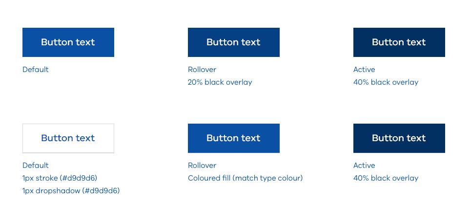
Recommended specifications:
- type size: 20px
- font: VIC Med
- placement: Type should be balanced horizontally
- padding: 24px top, 40px right, 24px bottom, 40px left
- height: 60px – This is important. On mobile screens buttons need to be at least 44px in height to be easily tappable
Medium buttons
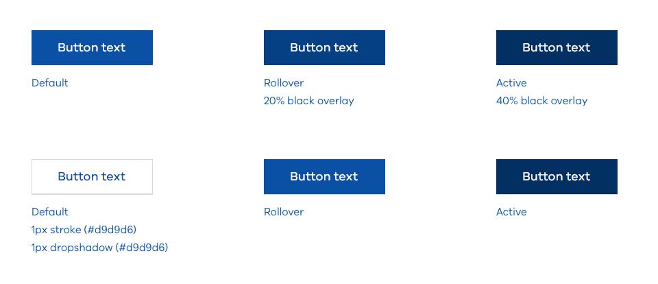
Recommended specifications:
- type size: 18px
- font: VIC Med
- placement: Type should be balanced horizontally
- padding: 20px top, 40px right, 20px bottom, 40px left
- height: 50px – This is important. On mobile screens buttons need to be at least 44px in height to be easily tappable
Maximum width (character limit)
To ensure buttons remain functional, it is recommended text within a button is limited to approximately 20 characters. If the required text exceeds 20 characters, it may still be used, but it may be worth evaluating the copy. If it’s crucial to the user experience button width may be increased.
We follow the Australian Government Style Manual: Links
Use concise keywords for call-to-action text or buttons. Accurately describe what will happen next
Updated 10 January 2023
Join the conversation on digital
Get advice and share your insights with other digital practitioners. Join the Single Digital Presence Community of Practice(opens in a new window).
About the VIC Government
- The Premier and ministers
- Find a Vic Gov department, agency or service
- Strategies and policies
- Inquiries and royal commissions
Grants and programs
Jobs and careers
Arts, culture and heritage
Business and the workplace
- Mentally Healthy Workplaces Framework
- Portable Long Service Authority
- Victoria’s racing industry
- Workforce Inspectorate Victoria
- Liquor licensing, sale and supply
Communities
- Children
- First Peoples - State Relations
- Finding records
- Gender equality & women’s leadership
- LGBTIQA+ equality
- Multicultural communities
- Seniors Online
- Veterans support and commemoration
- Volunteering in Victoria
- Youth Central
Education and training
- Victorian Early Childhood Regulatory Authority
- Early childhood education – information for professionals
- Kinder: Best Start, Best Life
- Education – information for parents
- Schools.Vic - information for schools
- Education grants, programs, awards and events
- PROTECT
- TAFE, training and universities sector
- TAFE Victoria
- Victorian Skills Authority
- Apprenticeships Victoria
- Learn Local
Environment, water and energy
Finance and economy
Health and social support
- Family violence reform
- NDIS Worker Screening Check
- NDIS and disability services and support in Victoria
- Patient Review Panel
- Transforming Trauma Victoria
Housing and property
Law and justice
- Adoption
- Births, deaths and marriages
- Honorary justices
- Machete ban
- Safeguarding Victorians against terrorism
- Stolen Generations Reparations Package
- Victims of Crime
- Victorian Racing Tribunal
Safety and emergencies
- Emergency Recovery Victoria
- Victorian Emergency Relief and Recovery Foundation
- Emergency Recovery Resource Portal
- How well do you know fire
- Fire Services Reform
- Water safety
- Marine Search and Rescue
Science and technology
- Data sharing and open data
- Data.vic - discover and access Vic Gov open data
- Developer.Vic - portal for API developers
- Go.vic URL shortener
- Vic Gov IT project dashboard
- Victoria’s free public wi-fi network
- Cyber security in the Victorian Government
Sport and recreation
Traffic and transport
- Cameras Save Lives
- Transport Fines
- Getting Around
- Transport Planning
- Transport Future
- Climate Change and transport
- Future Directions For Transport
- Transport projects
- Ports and Freight
Working in the Victorian Government
- Single Digital Presence home
- Accommodation and Library Services
- Executive employment in the Victorian public sector
- Budget, procurement and funding
- Careers in the Victorian Government
- Council and Regulator Toolkit
- Guidelines for working in government
- Join a government network
- Standards and guidelines
- VicFleet CarPool
- Victorian Government style guide